Showing posts with label colour theory. Show all posts

Saturday, 1 February 2014

Dirty Colours and Valentines Cookies

It's amazing how often what we're looking for is right in front of us, isn't it?
And I'm not trying to be deep and philosophical here - this is a baking blog; it's supposed to be light and fluffy and taken with a pinch of salt ; )
No, I'm talking about that jar of mayonnaise that you turn the whole fridge upside down to find, while it's right at eye level all the time (cunningly disguised as... a jar of mayonnaise!) 
Or the sunglasses on your head. Or the child on your hip - and you might not believe it, but that one really did happen. Not to me, of course - my husband.
On this occasion it was the clock on the wall. 
Well, ok - it wasn't quite that simple.
I had an idea of the colours I wanted for our Lovebirds / Valentines Cookies class, but couldn't find an image that pulled it all together for me. So, frustrated with the intangible inspiration, I muddied through the task, eventually getting the shades exactly as I wanted. Two days later I looked at the clock on our kitchen wall and realised: oh, hey - there it was - my inspiration. Right in front of me. 
Duh! 


I can't think of any other description for these shades than "dirty". Which is perhaps appropriate (or very inappropriate??) for Valentines Cookies. 


A "clean" colour is one that has very little or no black/grey in it. It is bright and pure. 


A "dirty" colour had been muted/ "muddied" with grey or black. 


To achieve this effect you just add a smidgeon of black (gel colour) to your already-coloured royal icing; mix it in (get over your initial horror as the first streaks of black appear) and repeat until you've got the dirtiness you're after. 
With ivory you'll probably stop after the first smidgeon; with blue and brown you'll need a drop or two more - but go slowly. If you find that you've over done it, add a little of the original gel colour to brighten up the icing again. 
It's a fascinating way to transform a colour. And the common thread of black really pulls all the colours in the project together. 


Just as I've already written about the use of warm and cool colours together, as a rule of thumb - use dirty colours together and clean colours together, but don't mix the two groups. 


Happy decorating!

xxM 

Monday, 9 December 2013

Christmas Reds

So, last week was pretty busy. Four cookie classes in 6 days; I worked out that I baked close to 700 biscuits and made over 6kg's of royal icing. This week is easier - just 30 or so mini Christmas cakes. It'll be a breeze!

Last year I was completely over the combination of red, white and green by the time Christmas day arrived, and I was determined not to use those same colours again for this year's Christmas cookies…do you think I succeeded?


Clearly not. But the addition of pale green made it seem fresher to me. And I also enjoyed working with the combination of red, white and brown.  


But next year - definitely something different!

While we're on the subject, though: let me just share with you a bit about reds. 

I usually use a combination of Red Red or Tulip Red and Super Red to get a fresh, true red like the one in the cookies above (Cake Flora or Americolor gels). 
You have to use a lot of colorant to achieve a decent red, so it's preferable to use Tulip Red which is not bitter (and to my eyes, indiscernible from Red Red). 


In the picture above, from left to right: Xmas Red, Tulip Red, Red Red and Super Red. 

Xmas Red? Not really - more like Xmas pink. But a cheery pink, at least! 


Ok, I'm off to bake some more fruitcakes. 

Happy decorating!
xxM 

Saturday, 30 November 2013

In the Pink

If I were to catalogue things that are completely useless (and wouldn't that be a completely useless exercise?!) at the top of the list: the last 6 months on your passport.

So, yesterday while I should have been creating something delicious in my kitchen to share with you, I was at Home Affairs renewing my passport (which expires in July!) instead. Oh, well. At least it's now done for another ten 9.5 years!
But I'll have to share some colour theory with you instead of a new recipe. Ok?

These were the colours I was working with in the "Cake and Cupcakes" cookie class, and I absolutely loved the colour scheme  - but it took a bit of finessing to get it just right:
Pink, teal, white and brown.  


Here's Teal vs.Turquoise:
                                                                                                   (Americolor / Cake Flora gel colours).


Both are gorgeous colours; the teal is just a tinge more green.
But not the tinge of green I wanted. So, I created another teal using turquoise and a drop (yes, that small) of mint green.


And as for the pinks - 
Here's Deep Pink vs. Soft Pink:


Deep Pink on the left - cool (blue) undertone. Soft Pink on the right - warm (yellow) undertone.

It's really helpful to figure that out because - as a rule of thumb - sticking to colours with the same undertone (warm or cool, not both) in a project leads to a harmonious visual effect.
(And oh, how I love a harmonious visual effect!)


Boldly mixing cool and warm palettes can create an off-beat effect.


And using a predominance of one with contrasts of the other can create both interest and balance.

Just a little something to bear in mind if colour choices are stumping you : )


Happy Creating!

xxM

Tuesday, 15 October 2013

Navy Blue

The label on the bottle says it is "navy" blue, but it seems like you've added half the bottle before it bears the slightest resemblance to the colour you're aiming for - don't get blue!
There's a trick to navy blue, and it is called black. And patience.  Okay, not very magical. But there you have it - it works : )


So, If you are using gel food colour to get navy royal icing - add a drop or two of black (not too much) - it may not look very navy at first (more like a dark blueck!), but leave it overnight and that brooding blue will have a chance to come out of its shell and show its true colours - you'll be pleasantly surprised at the result.


Octopus design inspired by Yankee Girl Yummies (and her octopus did have 8 legs - a true professional!)
Beach scene from a tutorial by the amazing Amber of Sweetambs.

Happy decorating!
xxM

Wednesday, 17 April 2013

"Ole'!" Colours

Our home was a hive of busy-ness today:
Builders, carpenters, plumbers, tilers. Lots of noise and dust and activity.

I was hiding away in my tower, doing some alchemy.
Well, that's what I pretended to myself. Actually I was sitting in the dining room, mixing royal icing colours for our "Ole'!" Mexicano cookie class. But it did feel like I was dabbling with exotic potions! A touch of this and a little of that and - voila!

LilaLoa (great cookie artist and guru of colour  color!) posted recently about how she mixes her royal icing colours:
Read all about it here: "Let's Talk about Hue - Make your Colors Match." (11 April 2013)

So that's what I tried with the icing for the "Ole'!" class we have coming up.
And it worked! Of course ; )

I've chosen a pretty vibrant colour palette for the theme, with boldly contrasting hues.
Using Georgeanne (LilaLoa) 's tip of mixing a tiny bit of each colour in with the other colours (read her post if you want that to make sense! I'm dabbling and babbling - she's the pro!) just helped to bring the hues together.

What do you think? I really should have taken a before-and after-picture, but hey-ho - I didn't!


For the royal icing recipe I use, go here
For some tips on working with royal icing, go here (which, co-incidentally, I wrote after my very first batch of "Mexican" cookies). 


Can't wait for the class - Ole'!


xxM 

Sunday, 20 January 2013

The Blues...and Reds

So, I've been struggling to find my groove this year. Battling a crisis of confidence (spending too much time looking at all the stunningly perfect creations out there!) and feeling emotionally drained (Sabrina has not been happy about starting school), and getting too little sleep; I'm not feeling on form, yet.
But, I'll get there!!

What really helps me to get excited about a project, is when I have "clarity of colour". When I know the colour combinations I'm going to be using, and they're just right, it really inspires and motivates me.
 
For our first class this year, I was steering away from anything red, white and green. Overdosed on Christmas colours in December, you think? (In fact, I'm not even planning on using red for Valentine's classes this year! )
Last year I'd made some owl cookies with blue, brown, and orange (I hadn't planned that combination beforehand; they were just the non-red and non-green bags of icing left over from a class where we'd decorated snowmen and reindeer). I loved the way they looked together.
So, it seemed like a great idea to use those colours again for the "Birds" classes.
But when I did my demo cookies, the orange seemed too orange, and I toned it down to "peach" for the class. Insipid. (And I know the ladies in the class didn't like it either - they came right out and told me! Gotta be tough in this game! )
In an attempt to oomph it up, (in preparation for the next class - not wanting to offend my cookie-gals, again!) I reluctantly added a couple of drops of red: "Red Red", to be precise. Gorgeous result! Exactly the colour I should have been aiming for in the beginning. Inspiration!

"Melon Pink" and Electric Blue


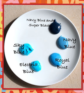
Often, though it can be more frustrating than that, and it can take a lot of tweaking to get the right shade. It doesn't help that the names of gel colours can be very deceptive. (I really can't tell the difference between Sky Blue and Electric Blue, can you??; and clearly Red Red is pink. Melon pink.)


"Melon Pink" at 10 o'clock
Sky vs. Electric?? 


There certainly isn't anything wrong with blending colours - and it's often the only thing you can do if you want a particular shade.

I usually blend together a few (often random!) shades to get the colour I'm looking for. And then have no idea how to reproduce that colour again! So, I think, for my next few projects I'm going to challenge myself to stick to the colour that's in the bottle. Gulp! Will I be able to resist a tweak here and there? Let's see how that works out!

There are some really helpful posts out there - try these ones by Lilaloa, and Sweetsugarbelle, that give great advice about colour and how to create certain shades...

(As a matter of interest, locally we have the Cake Flora gel colors and I strongly suspect that they are the same as the Americolor range. )


Stay tuned for some "no-colour-blending" Valentines projects over the next few weeks!


xxM


Saturday, 8 December 2012

Christmas Colours and Royal Icing

Wow, it's been a super-busy week! And another one's coming!!

So here's a super-quick share:
Cookie baking and decorating season has arrived with a bang (and the occasional fizzle as our royal icing virtually melts in this humidity!)

For Christmas, I've been using the following gel colours (good for royal icing, buttercream, and tylose paste and fondant):
For red: a mix of Super Red and Tulip Red - the tulip red isn't bitter like other reds.
For green: Forest Green


I've included a Teal / Sky Blue mix in the icing we've been using in the classes, too. It's a beautiful blue that complements the other Christmas colours so well.


A word of caution with Sky Blue, though. Despite its name, there isn't much subtlety about this colour - even a small drop can result in a lot more blue than sky! Use restraint, only a tiny amount is needed to get a pretty, light blue.


And remember to add some Bright White to your white, to get that clean crisp snow-white appearance.


For brown royal icing I always add cocoa powder as well as brown gel colour.
I do this for a few reasons: To minimize the amount of chemical ("E-number") colourants we're consuming; to enrich the colour; and very importantly: for me if it's brown it needs to taste like chocolate!


So I add a tablespoon of sifted cocoa powder to 250g of royal icing, and varying amounts of gel colour to get the desired brown. Adding purely cocoa powder - without food coloring - seems to make the icing heavy and sticky. Which is manageable if you are using it on its own, but it doesn't work well in conjunction with the other non-cocoa icing.


Happy creating!

xxM